The demo looks like magic—what “pattern” are you actually expecting?
You watch a slick demo: a dashboard lights up, a curve bends, a few alerts pop, and suddenly it feels like the system “found a pattern.” Then you try to map that to your business and hit the wall: what pattern, exactly, and what would count as proof it’s real?
In practice, “pattern” usually means a repeatable link between inputs and an outcome you care about. If you show a model customer behavior and the later purchase (or churn), the pattern is whatever mix of behaviors reliably shifts the odds. If you can’t name the outcome, the model can’t be evaluated.
They look like small changes in probability across thousands of cases, and they can fail quietly when the world changes—pricing, seasonality, competitors, even a new signup flow. Getting clear on the pattern you expect is how you avoid buying a good demo that can’t survive next quarter.
From messy events to something a model can learn from
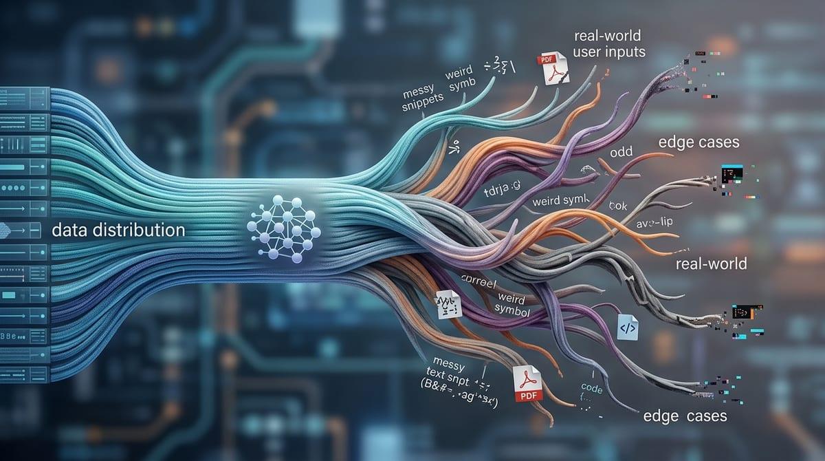
That “next quarter” failure often starts earlier, in the way real business activity shows up as data: scattered events, missing fields, and names that mean different things across teams. A signup might be three separate logs (web, mobile, email verify), a “purchase” might include refunds or trials, and a churned user might still appear active because a background job ran.
Before a model can learn anything, you usually have to turn those messy events into a consistent table of examples. That means picking a unit (user, account, transaction), a time window (last 7 days, last 30), and a clear cutoff so you don’t accidentally include “future” information. If you predict churn, you can’t use a support ticket created after the cancel date, even if it sits in the same system.
This step is more work than most demos admit. It takes cross-team agreement, backfills, and ongoing monitoring when tracking changes. Once the data is shaped into repeatable examples, you can finally ask a model to learn from them.
When patterns come from examples: supervised learning in plain terms
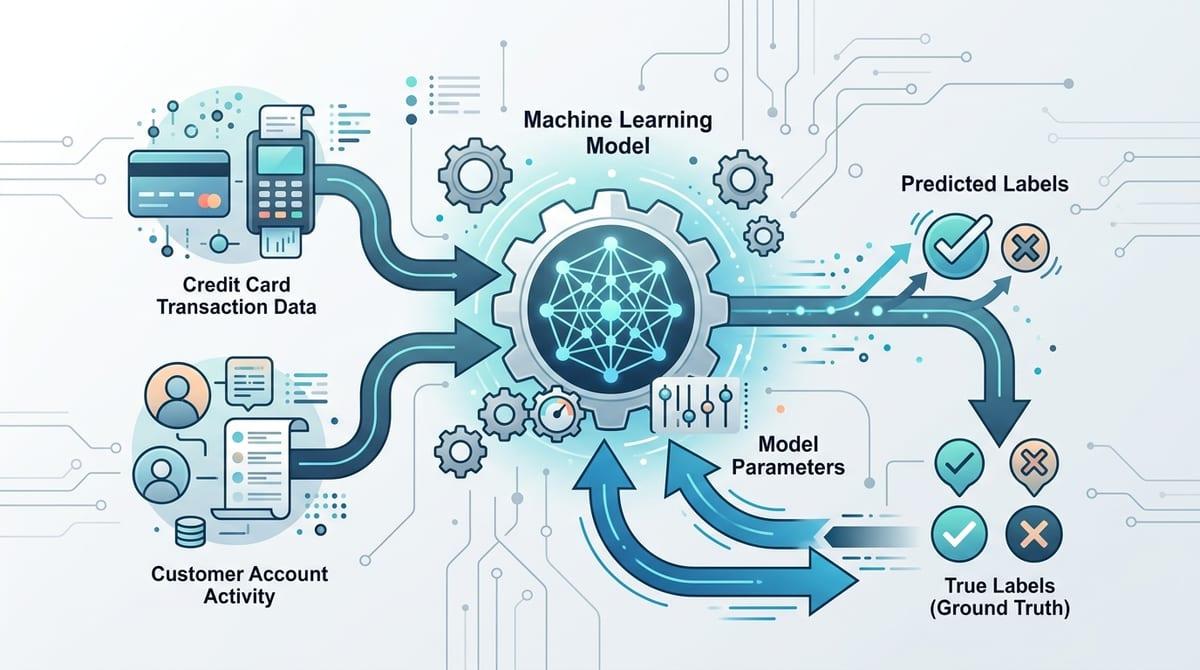
“Learn from them” usually means supervised learning: you hand the model many past examples where the outcome is already known, and it practices mapping inputs to that outcome. Think fraud: transactions labeled fraud/not fraud. Or churn: accounts labeled “canceled within 30 days” vs “stayed.” The model adjusts itself until it predicts those labels well on data it hasn’t seen yet.
What makes this work is feedback. If the model guesses wrong, the training process nudges it away from patterns that don’t hold up and toward ones that do. But it only learns what your labels actually represent. If “churn” mixes involuntary card failures with deliberate cancellations, you may get a model that’s accurate but points your team at the wrong fix.
You either rely on noisy system definitions or pay people to review cases, and both choices shape what the model can notice inside your inputs.
Signals, not stories: what the model ‘notices’ inside your data
That “what the model can notice” is rarely a human-style explanation. In a churn model, it doesn’t “see” frustration or loyalty. It sees inputs that move the odds: a drop in weekly sessions, longer gaps between logins, a plan downgrade, three failed payments, a recent support chat, and how those signals combine.
Most models work by assigning weight to many small hints, not by discovering a single rule. A user who logs in less might be fine if they also just invited teammates and increased seat count. Another user with the same login drop might be high risk if they also stopped using a key feature. The “pattern” lives in these conditional combinations.
The model will latch onto whatever is easiest to predict from your data, including shortcuts. If “VIP” accounts get routed to better support, “support response time” can look like a churn cause when it’s really a policy artifact. When you can’t label the outcome cleanly, you need a different way to find structure.
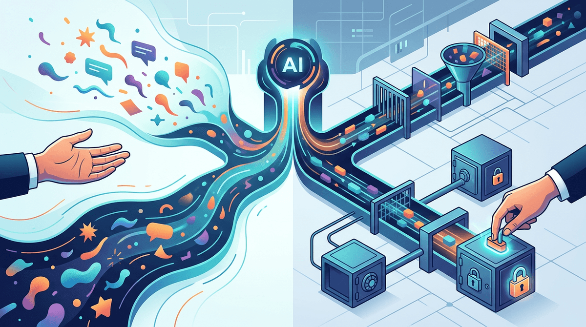
If you can’t label it, can AI still find structure?
That “different way” often looks like this: you know something feels off in the business, but you can’t agree on a crisp label like “fraud” or “about to churn.” You still have piles of behavior—click paths, transactions, support messages, device fingerprints—and you want the data to group itself into something you can inspect.
Unsupervised approaches do exactly that. Clustering can group accounts with similar usage shapes (heavy API users vs. occasional dashboard users). Anomaly detection can flag events that don’t fit the usual patterns (a new payout pattern, an unusually fast signup-to-purchase sequence). Text embeddings can group tickets by recurring themes without you predefining categories, which is useful when issues change every release.
These methods find “structure,” not meaning. You’ll still need time to review clusters, name them, and decide what action exists for each group—otherwise you’ve built a neat map with no path forward.
The uncomfortable moment: the model is accurate, but can you act on it?
That “no path forward” problem often shows up right after your first promising evaluation. The model scores well, the AUC looks strong, and the alert list “feels” right in a few spot checks. Then someone asks the uncomfortable question: what do we do differently on Monday because of this number?
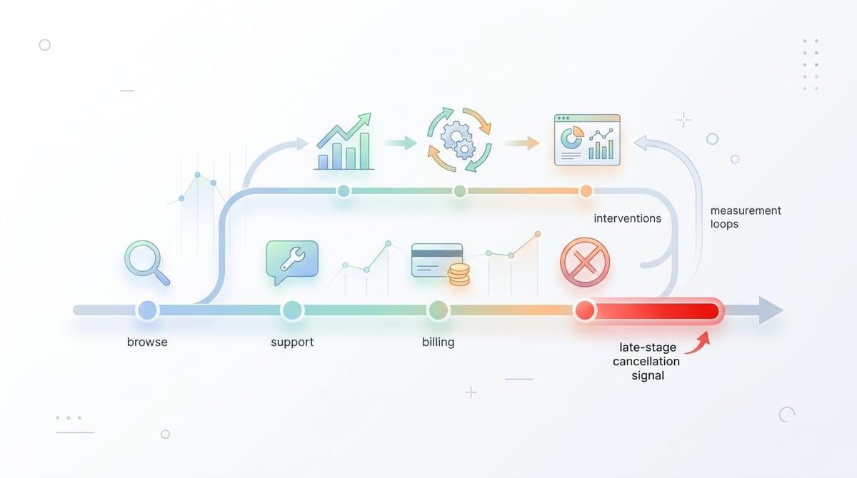
If the output is just a risk score, you still have to turn it into a decision rule. Who gets contacted, offered an incentive, blocked, or routed to a human—and how soon? If you can’t name a specific action for each band (for example, top 1% risk gets manual review, next 5% gets a softer friction), the model becomes a report that people glance at and ignore.
A churn model can be “right” because it detects late-stage signals, like a cancellation page view. That helps forecasting, but it won’t save accounts. To make it actionable, you need earlier signals, operational capacity, and a way to measure whether interventions helped, which sets up what to check after the first win or miss.
What to look for after the first win (or miss)
That measurement piece is where most “successful” models get tested for real. After the first launch, watch whether performance holds by week and by segment, not just in an overall score. If churn prediction stays strong for small teams but collapses for enterprise accounts, you’ve learned where the data or behavior differs.
Then pressure-test the decision layer: how many cases can ops actually handle, and what happens when volume spikes? A top-1% review queue that works in a quiet month can drown a team during a promo.
Finally, track drift and feedback loops. If your outreach changes behavior, yesterday’s pattern may stop matching next month’s reality, which is your cue to revisit features, labels, and the actions tied to them.