The demo score looks great—so why does it feel risky to ship?
The vendor demo runs smoothly, the benchmark slide shows a top-line score, and everyone in the room can picture the launch. Then you picture Monday: users paste messy text, ask half-formed questions, upload blurry photos, or hit cases the demo never showed. That’s where the risk comes from—your product doesn’t get graded on “average,” it gets judged on the few failures people remember.
Most scores reward matching a dataset’s idea of “correct,” not completing your user’s job with acceptable speed, tone, and safety. If the test set is clean, or the prompts are hand-tuned, a number can look stable while real traffic produces new failure modes. The uncomfortable part is practical: you may not even have the time to reproduce the complaints unless you plan for it upfront.
So the real question isn’t “what score did it get?” It’s “what kinds of mistakes does this score ignore?”
When a single number hides the thing you actually care about

Those ignored mistakes usually aren’t random; they cluster in places your users hit every day. A single accuracy or F1 score can stay high even if the model botches the one field that triggers a support ticket, like misreading a “refund” request as “return status,” or pulling the wrong date from a long email thread. If the metric averages across many easy cases, the hard ones become a rounding error.
It gets worse when the score compresses different failure types into the same penalty. A “slightly off” summary and a summary that invents a policy can both count as “incorrect,” even though only one creates legal or trust risk. The same goes for latency: a model that answers correctly but takes eight seconds may be “better” on paper and still lose users in a chat flow.
The fix is simple to say and annoying to do: break the number into slices that match your product’s stakes, then insist on seeing them separately.
What changed between the benchmark and your product day-to-day?
Once you start slicing the score, you usually find the “good” number came from a different world than your day-to-day. The benchmark text is well formed, the labels are consistent, and the task stays the same from row to row. Your product isn’t like that. Users switch intent mid-message, paste screenshots, mix languages, and ask for exceptions to your policy.
Small shifts compound. A support agent might shorten prompts to save time, a template changes after a policy update, or your app starts sending longer conversation history to improve context. If the model was tuned on short, single-turn examples, that extra context can push it into the wrong answer format or make it “helpfully” fill gaps it shouldn’t. Even harmless UI tweaks—like adding an optional attachment—can create a new failure mode if the model now tries to interpret empty or low-quality inputs.
The annoying constraint is that you often can’t “fix” these shifts with a quick prompt edit. You need to name the top three ways real traffic differs, then test those differences directly.
A model can ‘improve’ while users complain more—how does that happen?
Test results often climb after a tuning pass, and then the inbox fills with “it feels worse.” That happens when the model gets better at the easy majority and worse on the moments users notice: refusals, wrong actions, or answers that sound confident but miss the point. If your metric counts “close enough” as correct, you can raise the score by becoming more generic—shorter summaries, safer language, fewer specifics—while real users lose the detail they needed to finish the task.
Another common pattern is format and policy drift. A model can hit more “correct” labels but start violating your UI contract: returning JSON that doesn’t parse, changing field names, or adding extra text that breaks an automation. Or it may become more cautious after safety tuning, refusing borderline but valid requests like “cancel my order” when the customer sounds angry. The score improves; throughput and satisfaction drop.
The hard part is time: complaint review and error bucketing take real hours. If you don’t budget that work, you’ll keep shipping “improvements” you can’t explain.
If you can’t audit the mistakes, you can’t trust the metric
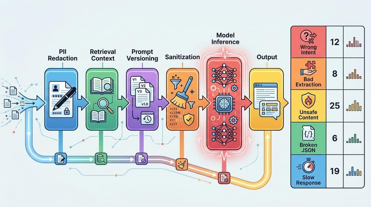
That “you can’t explain it” problem usually shows up in a familiar way: someone forwards three angry tickets, and the team can’t reproduce any of them. The score says the model is better, but you don’t have the exact inputs, the retrieved context, the prompt version, or what the model saw after sanitization. Without that trail, you end up arguing about vibes because you can’t point to a concrete mistake pattern.
A trustworthy metric has to come with an audit path. You need a small, reviewable set of failures tied to user impact: wrong intent, bad extraction, unsafe content, broken JSON, slow responses. Then you bucket them and count them. If a vendor won’t share failure examples or you can’t log real inputs due to PII, plan for the cost: redaction, synthetic variants, and a human review workflow that won’t collapse after week one.
Once you can audit, the next step is to make the test look like what actually hits production.
Designing an evaluation that looks like real traffic (not like the paper)
That usually means your first “test set” is a spreadsheet of clean examples and ideal prompts, because it’s fast and everyone can agree on what “correct” looks like. But real traffic arrives with missing fields, long threads, mixed intent, and junk inputs, and your evaluation has to include those on purpose. Pull a sample from logs (or build synthetic lookalikes if you can’t store PII), keep the exact prompt templates and retrieval settings, and freeze versions so you can rerun the same cases after changes.
Then slice it the way your product breaks. Create buckets like “short vs long,” “has attachment vs none,” “new vs returning user,” “policy edge cases,” and “must return valid JSON.” Add stress cases that force the failure modes you fear: empty inputs, contradictory instructions, hostile tone, and timeouts. If a vendor claims “95%,” ask for that number per bucket, not blended.
The hard cost is review time. Plan who labels disagreements, how you resolve them, and what you’ll do when the “right” answer is genuinely unclear—because production will be unclear too.
A score you can ship with: turning metrics into a go/no-go decision
That “right answer is genuinely unclear” is exactly why a shipping score has to behave like a release checklist, not a trophy number. Pick a small set of product-facing gates: complaint-driving errors per 1,000 sessions, JSON parse rate, median and p95 latency, and a safety/PII violation rate. Set thresholds per bucket, not overall, and make “must-pass” buckets explicit (for example, policy edge cases and automation-critical flows).
Then tie the score to an action: ship, ship behind a feature flag with monitoring, or block. Blocking will happen more than you want, because getting enough labeled edge cases and doing weekly error review takes hours you have to schedule. If the team can’t commit that time, the honest decision is to narrow scope until the gates are measurable.
Once those gates exist, vendors and internal teams stop arguing about “better” and start negotiating what “safe enough” means for your users.